

Democrats chose red

By Patrick Colbeck | July 3, 2026
The association of red with Republicans and blue with Democrats — today seemingly immutable — is a remarkably recent accident of media history, cemented only during the extended Florida recount of the 2000 presidential election. For most of American history, the opposite was true: blue was the color of Republicans, rooted in the Union Army’s dark-blue uniforms from the Civil War, while red was associated with Democrats — and globally, with socialism, communism, and revolutionary labor movements. The shift from this historical arrangement to today’s familiar red-Republican/blue-Democrat schema unfolded through a sequence of television production decisions, journalistic choices, Cold War stigma, and ultimately one of the most disputed elections in American history. Embedded within this color story is a deeper narrative about how party ideologies, coalitions, and cultural identities transformed across two centuries.
Red as the Color of Revolution and Socialism
The political meaning of the color red long predates American electoral maps. During the French Revolution, Jacobin radicals adopted a red cap — the bonnet rouge — as a symbol of emancipation from servitude, though it became equally associated with the Reign of Terror’s bloodshed. By the early 1800s, as the language of “socialism” and “communism” developed alongside industrialization, red became the emblematic color of the labor movement.
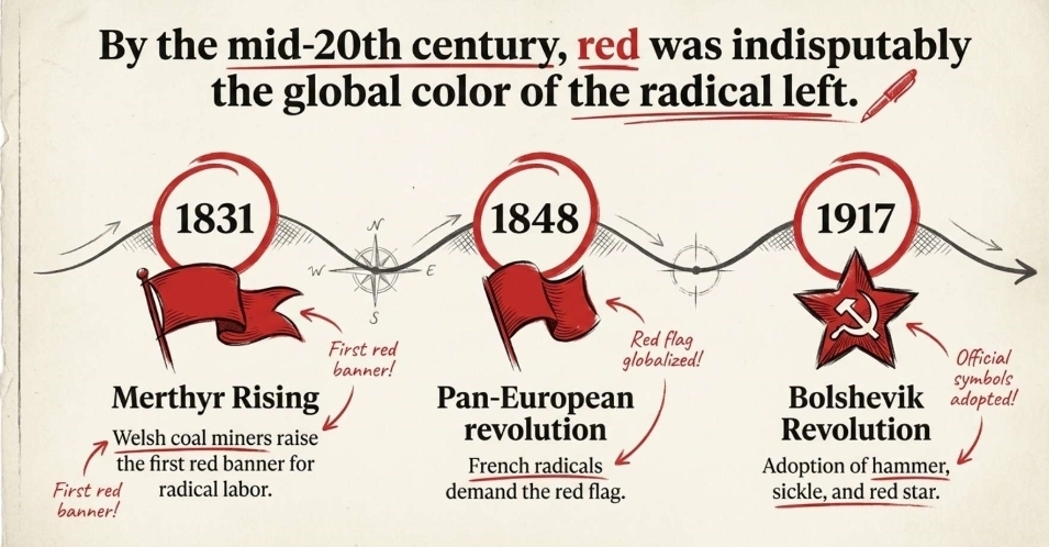
The earliest documented political use of the red flag as a revolutionary banner came during the Merthyr Rising of 1831 in Wales, when coal miners raised red banners in protest against industrial exploitation. In 1848, during the pan-European revolutionary wave, socialists and radical republicans in France demanded that the red flag be adopted as their national symbol. The red flag subsequently became the emblem of the British Labour Party from its founding in 1900 until 1986, when the party replaced it with a red rose. The hammer and sickle — the defining icon of Soviet communism — was first used during the 1917 Russian Revolution and became the official symbol of the USSR’s flag in 1924. The red five- pointed star, which had originated as a military symbol in Tsarist Russia, was adopted by the Bolshevik Red Army from 1918 onward and came to represent the triumph of communism across the five inhabited continents. By the mid-20th century, red was indisputably the global color of the radical left — from Soviet and Chinese flags to protest banners across Europe, Asia, and Latin America.
Blue as the Color of Conservatism
While red meant revolution, blue historically meant conservatism and established order. In Great Britain, blue was the color of the Tory Party — the Conservatives — while red belonged to the Labour Party. This British convention reflected a broader European pattern in which blue signified political stability, authority, and wealth (blue was historically the most expensive color pigment to produce), while red signified passion, radicalism, and upheaval.
Roy Wetzel, the general manager of NBC’s election unit who oversaw the network’s iconic electoral maps from 1976 to 1988, explained the reasoning behind NBC’s original color choices with characteristic directness: “Without giving it a second thought, we said blue for conservatives, because that’s what the parliamentary system in London is, red for the more liberal party. And that settled it.” This British-derived convention — conservatives in blue, liberals in red — was the default starting point for American television’s earliest color-coded maps.
Pre-Television Color Coding — Maps, Newspapers, and the 19th Century
The Scribner’s Atlas (1883)
Historian Susan Schulten has traced the practice of mapping U.S. elections by color to 1883, when the Scribner’s Statistical Atlas of the United States was published. On those maps, red denoted Democrats and blue marked Republicans — a scheme that reflected the Civil War-era color logic in which the Republican Party of Lincoln was associated with the Union Army’s blue uniforms. The Scribner atlas produced a strikingly familiar portrait: red blanketing the South (solidly Democratic) and blue dominating the Northeast and Upper Midwest (solidly Republican).
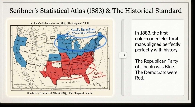
An 1880 Library of Congress map of presidential election results similarly shows blue representing Republicans in areas that today are Democratic strongholds. This visual arrangement — blue Republicans, red Democrats — was the dominant convention for 19th- century political cartography.
The 1900 Chicago Tribune Color Dispute
One of the earliest documented conflicts over political color assignments occurred in 1900. The Chicago Tribune, then a staunchly Republican organ that had championed Abraham Lincoln’s career since the 1850s, planned to signal election-night returns by setting off colored fireworks visible across the city: blue fireworks for Republican wins, red for Democratic wins. A Democratic-leaning competing newspaper threatened to announce returns using the opposite color coding — a direct attempt to prevent Republicans from claiming blue as their color.
The dispute is revealing. It shows that as early as 1900, both parties instinctively wanted to claim blue and force the red label onto the opposition — precisely because red was already becoming associated with revolutionaries, anarchists, and radical labor movements, while blue carried connotations of stability and legitimacy. The Tribune dropped the fireworks plan after the competing threat, but the incident illustrates that the ideological valence of the two colors was already clearly understood.
The 1908 Washington Post Map
The earliest documented use of a red-Republican, blue-Democrat electoral map in a major publication appeared in a July 1908 color supplement to the Washington Post, published during the presidential campaign between William Howard Taft and William Jennings Bryan. The map used red for Republican-leaning states, blue for Democratic states, yellow for “doubtful” states, and green for territories — an arrangement that, notably, was the reverse of both the 19th- century Scribner’s convention and the post-2000 standard.
That same year, the New York Times printed a special color map using blue for Democrats and yellow for Republicans to detail Theodore Roosevelt’s 1904 electoral victory. The inconsistency across publications in a single year illustrates how thoroughly arbitrary early color choices were — each outlet making its own decision with no coordination and no lasting standard.
The Television Era and the Birth of the Red/Blue Map
CBS in 1972 — The First Television Color-Coded Electoral Map
The credit for the first television color-coded presidential map belongs to CBS News during the 1972 election between incumbent Republican President Richard Nixon and Democratic challenger Senator George McGovern. CBS used blue for states won by Republican Nixon and red for McGovern’s Democratic states — following the British-derived convention of blue-for- conservatives, red-for-liberals. Nixon’s landslide 49-state victory meant most of the map glowed blue.
NBC’s Iconic Map of 1976 — Key Actor: John Chancellor and Roy Wetzel
election night, November 2, 1976. At the urging of NBC anchor John Chancellor, the network constructed a massive, two-story illuminated plastic map of the United States in Studio 8H at 30 Rockefeller Plaza — the same studio later made famous as the home of Saturday Night Live.
NBC election unit general manager Roy Wetzel oversaw its construction and color scheme. During testing, the map nearly melted under the heat of thousands of lightbulbs, requiring industrial air conditioning to be installed behind the structure. On election night, states turned blue for Republican incumbent Gerald Ford and red for Democratic challenger Jimmy Carter — directly mirroring British parliamentary color conventions.
At 3:30 a.m. Eastern Time, Mississippi turned red and NBC declared Jimmy Carter the winner. It was the first time a national television audience had watched a presidential election unfold through a live, color-coded map. The format was instantly captivating: “NBC’s electoral map was groundbreaking in that it was constantly on the screen,” observed Douglas Manning, son of NBC executive Gordon Manning. Crucially, in this foundational moment, Democrats were red and Republicans were blue — the exact opposite of today’s arrangement.
The Chaotic 1980 Election — Key Actor: David Brinkley
By 1980, color television had fully arrived and all three major networks were deploying electoral maps, but with incompatible color schemes that confused viewers switching channels. NBC maintained its 1976 convention: red for Democrat (Jimmy Carter), blue for Republican (Ronald Reagan). As Reagan’s landslide victory became apparent, NBC anchor David Brinkley quipped that the increasingly blue western portion of the Republican map was “beginning to look like a suburban swimming pool.”
On CBS, anchor Walter Cronkite told viewers that “the United States looks like it’s certainly red, white and blue — but mostly blue, tonight.” Both were describing a Republican-blue, Democrat-red map. ABC was the outlier: the network had used yellow for Republicans in 1976, switched to red for Reagan in 1980, and anchors provided inconsistent rationales. During the 1984 election, David Brinkley — by then at ABC — offered a memorably blunt explanation for using red for Republicans: “Red, R, Reagan — that’s why we chose red.” This informal, alliterative logic (“Red, R, Republican”) would prove enormously durable when Archie Tse at the New York Times made the same connection sixteen years later.
CBS Flips in 1984; NBC Holds Out
By 1984, ABC and CBS both used red for Republicans and blue for Democrats, while NBC stubbornly retained its original scheme of blue for Republicans and red for Democrats — which it maintained through Roy Wetzel’s tenure overseeing four election cycles from 1976 to 1988. NBC’s consistency was rooted in Wetzel’s explicit rationale: the British parliamentary model.
The result was genuine viewer confusion. A voter switching between NBC and ABC on election night in 1984 would see Reagan’s winning states colored blue on one channel and red on the other. This fragmentation persisted through the 1990s, with CNN, CBS, ABC, and the New York Times using red for Republicans and blue for Democrats by 1996, while Time magazine and the Washington Post still used the opposite scheme.
The Cold War Factor: Why Red Was Avoided for Democrats
Embedded in this decades-long inconsistency was a politically loaded anxiety. As NBC’s Chuck Todd observed in 2012: “For years, both parties would do red and blue maps, but they always made the other guys red. During the Cold War, who wanted to be red?” Journalist Mitchell Stephens noted in the same year that red “was a term of derision” throughout the Cold War era — featured in tabloid headlines, anti-communist rhetoric, and the Red Scare prosecutions of the early 1950s.
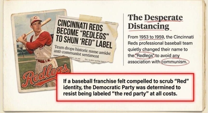
Senator Joseph McCarthy’s congressional investigations from 1950 to 1954 had made “red” synonymous with treason and subversion in the American public mind. McCarthy, a Wisconsin Republican, targeted the State Department, the Treasury, the White House, and even the U.S. Army with accusations of communist infiltration — generating a national climate in which the color red carried toxic political connotations. As one analysis noted, Democrats were consistently accused of being “soft on communism,” making the color red “particularly uncomfortable” for them.
Some early television maps used yellow for one of the major parties specifically to avoid the communist connotation of red for either party. The Cold War thus created a genuine political stigma around the color that influenced decades of media decisions — and ultimately played a role in why Democrats, when the final color consolidation happened in 2000, were given blue rather than red.
The 2000 Presidential Election — Cementing the Color Scheme
The Actors: Tim Russert, Archie Tse, Paul Overberg
The 2000 presidential election between Republican Governor George W. Bush and Democratic Vice President Al Gore produced the most consequential — and most consequentially accidental — standardization of political color coding in American history. The first documented use of the phrases “red states” and “blue states” in their modern sense occurred approximately one week before election day, on NBC’s Today Show.
Tim Russert, then NBC’s political director and chief White House correspondent, was discussing the electoral map with anchor Matt Lauer using an MSNBC map from a few days earlier — red for Republican, blue for Democrat — when Russert asked: “How does [Bush] get those remaining 61 electoral red states, so to speak?” Most commentators credit Russert with first giving the language mass circulation, though Russert himself could not recall the term’s precise origin.
Two days after the November 7 election, both the New York Times and USA Today published their first full-color, county-by-county presidential maps — both using red for Bush (Republican) and blue for Gore (Democrat). Archie Tse, then senior graphics editor at the New York Times, later explained the decision with disarming simplicity: “I just decided ‘red’ begins with ‘r,’ ‘Republican’ begins with ‘r.’ It was a more natural association. There wasn’t much discussion about it.”
Paul Overberg, the database editor who designed the USA Today map, provided an equally understated explanation: “The reason I did it was because everybody was already doing it that way at that point.” NBC’s election chief William Wheatley explained the network’s final switch in 2000 from its original blue-for-Republicans scheme by citing viewer confusion: standardizing with ABC and CBS would avoid “confusion for the viewers” switching channels on election night.
Why the 2000 Colors Stuck
The decisive factor was duration. The 2000 election did not end on election night — it continued for 36 days, through Florida’s statewide manual recount, a cascade of court battles, and ultimately a 5-4 Supreme Court ruling in Bush v. Gore that halted the recount and awarded Florida’s 25 electoral votes — and thus the presidency — to Bush.
For more than a month, the red-and-blue electoral map was omnipresent on cable news — which by 2000 had reached its peak influence as a medium — refreshed nightly as the Florida drama unfolded. William Safire, the political lexicographer and New York Times columnist who served as an analyst on NBC during the coverage, later recalled being moved to sympathy for the few remaining black-and-white television owners who could not see the colors.
When the 2004 election produced a nearly identical geographic pattern — with Bush winning the South, Plains, and Mountain West in red, and Democrat John Kerry carrying the coasts and upper Midwest in blue — the color arrangements were reinforced as stable, geographically coherent identity markers. By 2004, “red state” and “blue state” had entered the permanent American political lexicon, expanding beyond electoral shorthand to describe entire clusters of cultural, religious, and socioeconomic identity.
Why the Switch?
You now know how the colors evolved. The next question is simple but explosive: why did the parties switch — and who drove the change?
Theory One: The Blue Shift
One theory holds that Nixon’s Southern Strategy catalyzed a “blue shift” in party color associations — as the South migrated from Democratic to Republican, the remaining Democratic base consolidated in Northern and coastal states, gradually producing the red/blue map we recognize today.
However, this theory has a significant credibility problem: no prominent party players actually switched teams in any meaningful wave. The narrative of a wholesale ideological swap between the parties is largely mythological — the Dixiecrats who did defect to the GOP were a relatively small number, and most Southern Democratic politicians remained Democrats for decades after Nixon’s 1968 and 1972 campaigns.
Scholars have noted that the South’s rightward shift was driven more by generational replacement and new voter alignment than by sitting officeholders changing party labels. In short, the “blue shift via Southern Strategy” theory makes for a compelling historical arc, but it overstates the degree of elite-level party switching — undermining it as a clean explanation for today’s color-coded political map.
Theory Two: Accidental
The “accidental theory” holds that the 2000 color switch was purely a product of uncoordinated media decisions — most notably Archie Tse of the New York Times, who assigned red to Republicans simply because “red begins with r, Republican begins with r,” and NBC finally standardizing with other networks to reduce viewer confusion during the 36-day Florida recount.
Under this view, no ideology, strategy, or intention drove the switch — just typographers and TV producers making arbitrary calls. However, the accidental theory strains credibility when viewed against the backdrop of decades of deliberate media behavior around this very issue. As early as 1900, both parties instinctively fought to claim blue and force red onto the opposition — precisely because red already carried the toxic connotations of socialism, communism, and radical labor movements.
Throughout the Cold War, Democratic strategists and media allies were acutely aware that red meant Red — and outlets actively used yellow for one party simply to avoid assigning communist-coded red to Democrats. NBC’s Chuck Todd acknowledged the dynamic plainly: “For years, both parties would do red and blue maps, but they always made the other guys red”. The idea that legacy media — which had spent decades carefully navigating this ideological landmine — suddenly stumbled into a permanent red/blue assignment by accident in 2000, just as the Democratic Party’s activist wing was lurching leftward, is difficult to accept at face value. The more plausible reading is that the “accident” was a convenient resolution to a long-standing problem: Democrats finally got the blue they always wanted, and the media obliged.
Theory Three: Deliberate
The “deliberate theory” holds that the 2000 color switch was the culmination of a decades-long effort by a sympathetic media establishment to permanently rescue Democrats from the communist-coded color red and wrap them in the reassuring blue of law enforcement and conservative authority. This is the most credible of the three theories.
For over a century, every outlet fought to avoid coloring Democrats red — networks used yellow as a workaround, kept inconsistent schemes for decades, and actively navigated the Cold War stigma of red’s association with socialism and Soviet communism. The idea that this suddenly resolved itself by accident in 2000 strains belief — especially given who the central actors were. The man most credited with popularizing “red states and blue states” during the 2000 recount, Tim Russert, was no neutral journalist. Before his NBC career, Russert served as a senior aide to Democratic Senator Daniel Patrick Moynihan of New York and as counselor to Democratic Governor Mario Cuomo of New York.
That the person who gave the color framework its mass circulation had spent his pre-media career in the service of the Democratic Party is not a footnote — it is the story. The 2000 color assignment was less an accident than the logical endpoint of an institutional media culture that had spent decades ensuring Democrats would never have to own the color history assigned them.
Profile of Modern Democrats
Now let’s hold the 2000 color map up against the actual modern Democrat Party — and see which color history says they’ve earned.
Democrat Mayors
The Democratic Party’s most prominent urban leaders today bear ideological affiliations that align strikingly with the global political tradition historically coded red — socialism, revolutionary labor movements, and communist-adjacent governance.
Zohran Mamdani (New York City) — a member of the Democratic Socialists of America, elected Mayor of NYC in 2025. As recently as April 2026, Mamdani declared on Meet the Press: “I believe in democratic socialism even more than I did before the election.” Yale economists assessed his socialist-inspired proposals as fundamentally problematic for New York City’s economy.
Karen Bass (Los Angeles) — Long-time progressive Democrat whose record includes praising Fidel Castro and maintaining sympathetic ties to the Cuban regime, placing her squarely within the global left tradition historically symbolized by the color red.
Nithya Raman (Los Angeles) — A mayoral candidate and city council leader whose politics are explicitly rooted in Democratic Socialists of America ideology and whose policy program reflects unapologetic DSA priorities on housing, policing, and redistribution.
Janeese Lewis George (Washington, D.C.) — a DSA member on the D.C. City Council, who won the Democratic primary for Mayor in June 2026, making a democratic socialist the near-certain next leader of the nation’s capital. The Victims of Communism Memorial Foundation specifically flagged her ascent as a concrete example of socialism moving from abstract slogan to governing reality.
The fact that America’s largest cities are now governed by self-identified democratic socialists is not incidental to the color debate — it is the most powerful argument that the Democratic Party is, by every historical and international standard, the red party wearing blue.
Democrats in Congress
Bernie Sanders is no longer the lone member of Congress embracing socialism; he has been joined by Rashida Tlaib, Alexandria Ocasio‑Cortez, Cori Bush, and Jamaal Bowman, all of whom openly self‑identify as democratic socialists and operate in formal partnership with the Democratic Socialists of America. These members are not isolated outliers: they reliably command the support of a much larger bloc of congressional Democrats who avoid the “socialist” label while advancing the same agenda in practice.
As the document notes, marquee Democratic priorities such as Medicare for All, College for All, and the Free Palestine movement substantially overlap with the stated aims of both the DSA and the Communist Party USA, anchoring the Democratic caucus squarely within the ideological tradition that global political history has long coded in red.
Democrat Platform
The modern Democratic Party platform substantially overlaps with the stated goals of the Democratic Socialists of America (DSA) and the Communist Party USA (CPUSA), reinforcing the appropriateness of associating Democrats with the color red. Signature Democratic priorities such as Medicare for All, tuition‑free or “College for All” policies, expansive student‑debt cancellation, and aggressive Free Palestine activism mirror planks explicitly advanced by DSA and CPUSA, from state‑dominated health care and higher education to anti‑capitalist foreign policy and decolonization narratives.
Taken together, these overlaps place the Democratic Party’s national agenda firmly within the same ideological family that has flown under red banners around the world for more than a century — making the global convention of red for the left and blue for the right a far more accurate descriptor of America’s parties than the post‑2000 media color scheme suggests.
Conclusion: Arbitrary Associations Are Gone – Dems Chose Red
Whatever the true reason behind the 2000 red–blue party flip, the game is over: the modern Democrat Party is the red party.
If it walks like a duck and talks like a duck, it’s a duck — and this duck is wearing red. It’s time for Democrats to own the color they’ve chosen: to own red’s century-long association with socialism and Communism, and to own the chaos, coercion, and human misery that have marched under that banner around the world.
In 2000, legacy media wrapped Democrats in a comforting blue coat just as the party’s ideological trajectory was turning decisively red. In 2026, it is my hope that those who know our true U.S. history will lead a different kind of color revolution — stripping off that borrowed blue and putting red back where history says it belongs: on the Democrat Party.